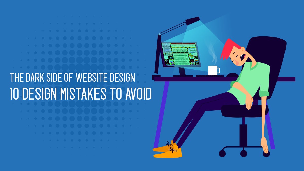
The Dark Side of Website Design: 10 Common Mistakes That Can Haunt Your Online Business
In today’s digital age, a website is the face of your brand. It’s the first impression that potential customers have of your business, and it’s essential to make it count. However, even the most well-intentioned website designers can make mistakes that can impact their website’s usability, accessibility, and effectiveness.
In this blog, we’ll explore ten of the most common website design mistakes that you might be making, and provide tips on how to avoid them.
- Neglecting Responsive Design:
Responsive design means designing a website that looks great and functions well on all devices, including mobiles, tablets, and desktops. Neglecting responsive design can make your website difficult to use on certain devices, which can lead to a poor user experience and reduced traffic. - Using Too Many Colors and Fonts:
Using too many colors and fonts can make your website look unprofessional and cluttered. It’s best to stick to a limited color palette and font selection to create a consistent and cohesive design. - Cluttered and Confusing Navigation:
A cluttered and confusing navigation system can make it difficult for users to find what they’re looking for on your website. A clear and easy-to-use navigation system is crucial for a positive user experience. - Poor Use of White Space:
White space is the empty space around design elements, and it’s essential to create a balanced and visually pleasing design. Poor use of white space can make a website look cluttered and difficult to read. - Slow Load Times:
Slow load times can frustrate users and cause them to leave your website. It’s essential to optimize your website’s images, videos, and other elements to ensure fast load times. - Lack of Visual Hierarchy:
Visual hierarchy refers to the arrangement of design elements to create a clear and organized visual structure. A lack of visual hierarchy can make a website difficult to navigate and hard to understand. - Inconsistent Branding:
Consistent branding is essential for building trust and recognition with your audience. Inconsistent branding, such as using different logos, colors, or messaging, can confuse and disengage users. - Ignoring Accessibility Guidelines:
Ignoring accessibility guidelines can make your website inaccessible to people with disabilities, such as vision or hearing impairments. It’s essential to follow accessibility guidelines to ensure that everyone can use and enjoy your website. - Over complicated Forms:
Over complicated forms can frustrate users and lead to a high bounce rate. It’s best to keep forms simple and easy to fill out to encourage users to complete them. - Not Testing Your Website:
Not testing your website can lead to hidden issues that can harm your website’s performance and user experience. It’s essential to test your website regularly to catch and fix any issues before they affect your users.
By avoiding these common website design mistakes, you can create a website that not only looks great but also delivers a seamless user experience that converts visitors into loyal customers. Remember that your website is a crucial marketing tool, and it’s essential to get it right.
In conclusion, whether you’re designing a website from scratch or revamping an existing one, it’s crucial to avoid these ten website design mistakes. Pay attention to your website’s usability, accessibility, and design to ensure that it delivers a seamless user experience that drives conversions and builds your brand’s reputation.
Keep in mind that many professional web design companies have strict standards and follow best practices to ensure that their clients’ websites are visually appealing, user-friendly, and fully optimized. If you’re looking for expert help to avoid the common mistakes discussed in this blog, consider working with a reputable web design agency like Mitrang Technologies.
