Project Overview
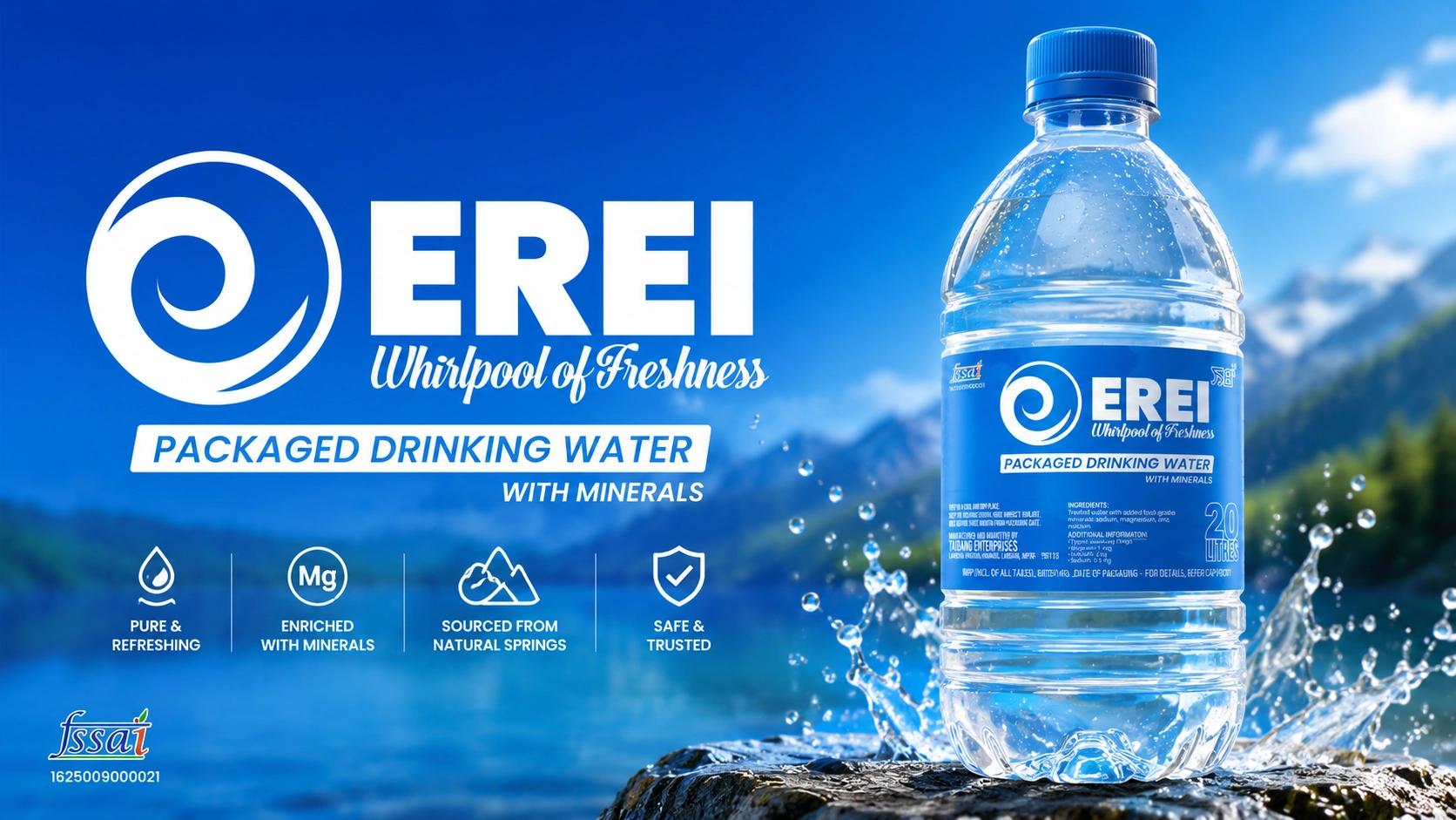
EREI is a packaged drinking water brand developed for Taibang Enterprises with the objective of creating a fresh, modern, and highly recognizable identity within the competitive bottled water market. The branding needed to communicate purity, freshness, trust, and quality while maintaining strong shelf visibility.
Design Concept
The visual identity was inspired by the natural movement and purity of water.
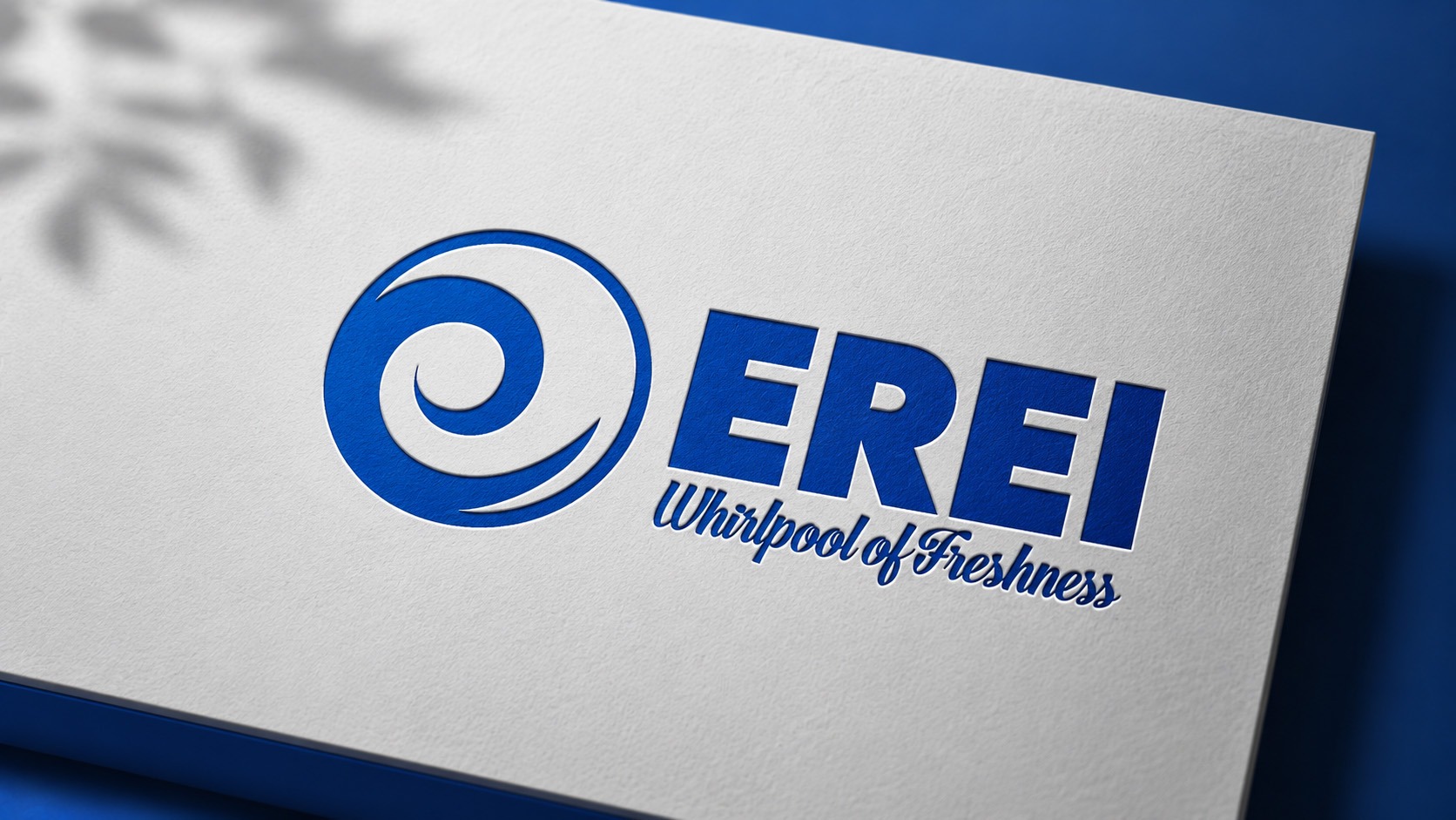
- Whirlpool Symbol: A dynamic circular icon representing the continuous flow, purity, and freshness of water.
- Bold Typography: Designed to ensure maximum visibility and brand recognition across retail environments.
- “Whirlpool of Freshness” Tagline: Reinforces the brand’s promise of clean, refreshing drinking water.
- Blue Color Palette: Carefully selected to symbolize purity, hygiene, trust, and freshness.
- Clean Packaging Layout: Structured information hierarchy improves readability and compliance with packaging standards.
The combination of strong branding and functional packaging design helps the product stand out while effectively communicating its core values.
Packaging Development
The project included the complete design and application of the brand across product packaging and promotional materials.
- Logo Design
- Brand Identity Development
- Bottle Label Design
- Product Packaging Design
- Print-Ready Production Files
- Brand Application Mockups
Design Highlights
- Distinctive and memorable water-inspired logo
- Strong shelf presence and brand visibility
- Clean and professional packaging design
- Consistent branding across product applications
- Scalable identity suitable for multiple packaging sizes
Outcome
The final branding provides EREI with a modern and trustworthy visual identity that reflects freshness, purity, and quality. The packaging design enhances product appeal while creating a strong foundation for future brand growth and market recognition.
Technologies & Tools
- Adobe Illustrator
- Adobe Photoshop
Designed by: Mitrang Technologies